Thursday, 5 May 2011

FINAL product

Okay, this is the final product. I had left a small space in the bottom left corner, no big deal. 
the site is really simple and easy to use, it was designed for such.
New game information that comes out is accesible from the thumbnails in the left corner, and if you wish to check news per console, on the sidebar or below the image in the middle.
all around easy to use really... well it should be.
everything is displayed in the box in the middle, that's all there is to it.

Just a quick note at the space UNDER the black box, once you CLICK the icons on the left, it would made the box open up and cover the space beneath it with all the information that is written about the game, and then retract when done with.
showing off that soul-like sphere at the bottom of the page, which i plan to show off.

It also has membership, which you can see in the top right corner.
I was thinking for the bottom left corner, having more information but...
it's fine how it is, want it to stay simple.
if you want to check your profile, everything is displayed in the middle.

the site is supposed to have some japanese feel to it, so i added some japanese writing, as if japanese people created this site. 
it's my attempt at something foreign, dont look down on me.
aight peace playa.

Thursday, 28 April 2011

so far what i have done

FUCK YEAH BITCH

website layout designs sketches thingies

the design im aiming to go for, this is my sketch so far.
i had a bunch of ideas but this is pretty generic, playing it safe, you know?
its all good, i like it.
i like that i added faq/contact us, some advertisement, the name and logo seperate
instead of the name of the site a logo.
bah whatever. shits good.

The website design i wish to create

The website i'd like to create would be something involving games most probably. seeing as how, pretty much, over half the sites i have mentionned involve games.
im a gamer. a big gamer, not too hardcore but i still play a lot.
more than the usual people. i like playing games on consoles and on pc, and since this is going to be on a computer, i guess ill make it involving flash games or pc games.
the colors i will use will have a game feel to it. i havent decided but i got some ideas, either black and red, blue and white, you know, evil or good kind of colors.

i'll do a sketch of what id like to do.

Thursday, 21 April 2011

Website Project.

Okay, for the website project, i have to find 4 websites that I find particularly interesting.
Not to be biased, but i'm going to put websites that i frequent regularly because i also like the designs, i like simple designs,
so here it is:

http://www.ign.com/

http://www.totaljerkface.com/

http://en.wikipedia.org/wiki/Main_Page

http://www.blogger.com/

http://www.newgrounds.com/

http://egoraptor.net/

http://mangastream.com/

so,

you can also note, these websites all have in common something really simple.
sure they utilize flash and all, but you can see the background are pretty much just squares and such.
and the colors are simple as well,

ign.
grey and white, i like the use of colors. it has a very gamer feel, i dont know if youd agree but it feels aggressive too.

totaljerkface,
site for the game happy wheels, happy being a 'happy' word, you can see the colors
light blue and light grey, seems like it fits for it.
jolly colors, tame, you know?


as you can see
the wikipedia is normal,
pretty much just white background and different tones of white,

blogger, some sort of beige with blue, not that i particularly like the use of colors, seems really.. warm.
which doesnt describe me, i like either black or white.


then you got newgrounds, which is interesting, cause i used to go on that site when i was 9. and i still do over a decade later. i like the layout, it has always been the same, black and grey. amazing.

egoraptor, now he's something else, his site leads to other sites, hes a funny flash artist guy, i enjoy his shit. his site is pretty gay looking though, blue and pink.

mangastream. where i read my manga, 2 colors, nothing special. i go on this site a lot aswell.

as you can see, everything, mostly all the sites so far have everything concentrated on the middle, and rectangles of colors surrounding the exteriors. and use little to none other than 2 colors.

Thursday, 7 April 2011

lolol


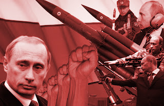
PICTURES FOR RUSSIAN SHIT


haters gonna hate

constru:ssian poster// audience targeted?

the audience targeted for my logo is...

Poster project [constructivism]

New project, about posters in russia, here's a little history to fill up some blog space:
Constructivism was an artistic and architectural movement that originated in Russia from 1919 onward which rejected the idea of autonomous art in favour of art as a practice directed towards social purposes. Constructivism as an active force lasted until around 1934, having a great deal of effect on developments in the art of the Weimar Republic and elsewhere, before being replaced by Socialist Realism. Its motifs have sporadically recurred in other art movements since.


if it's too hard to understand, which it is...  for me atleast, the art is supposed to target people? the message written pretty clear? plus it has to be in russian? anyways just check this shit out, i got a bunch i found on google images:


it's written in english as you can see, it should be in russian for it to feel 'authentic', so i will add some cyrillic to my final product, that's decided.
everyone probably saw this one coming, im sure a lot of my peers will have this up on their blog. I called it.
i think this image has to do with womens rights, again, i see the poster actually has the message written on it, along with a picture to further explain the message, with emotions being displayed on the faces of the characters, or, like above, a clenched fist to express anger? shit, i am a grade A genius.
cold war? viet cong? looks like a blackops poster to me. something to do with war, again, faces and writing at the bottom, by now, you can tell the colors that play a part in this artistic movement, red, black, and other faded colors that aren't primary colors.
i will be using that in my logo too, i concluded.
just a girl, with a long ass lanky arm, and it's in english... so doesnt look authentic. 
my favourite one so far, looks like it could have been done by someone in this classroom, i like the colors and different images used, i like the boxiness of the shapes used.
important in russian construcitivgbnfhnfgnmm
logo looks a little weird, but i get the concept, i like the sickle and hammer in the back, proves it's russian, aha
and stolichnaya is kickass vodka and smooth as fuck. bottle looks authentic too, unlike polar ice, skyy, and all those.


some more logos:
quit smoking, lololol
you can see the boxed up shapes and forms, curves, stars.. the color.. the russian lettering, it's a giveaway.
i found this tasteless.


Thursday, 24 March 2011

PT LOGO

Shit, i know it doesn't look like much.. but thats the T mounted ontop of a P.
I made the edges like spikes, when originally it was going to be square-ish.
the lines are pretty straight on the logo.
even though it looks like something easy, took me a while to come up with this design.

Digital design LOGO project

So this is my 'concept' for my logo.
My name is Peter T. 
So the initals for P and T are kind of hard to come up with, for a design.
So as you can see i had failed to make a bunch of PT's, trying to bunch them up together. 
you can see the one thats colored in is black. that is the finished project that i decided to work on and will show you and scan in a second.

Thursday, 10 March 2011

Logo poject 2

I searched for some logos I like, as you can tell by the logos, you can see what what kind of person I am.
From left to right, I will explain each logo, just to make the blog a little more interesting:
Anarchy, why this logo? why not? It's related to punk a lot, punk music, and I enjoy that kind of music, doesn't mean I am an anarchist though, hehe. It's also an inside thing between me and a friend, his name is Omer and his girlfriend's name is Alysha, and as you can see, he's inside her..
WELL THEN, next: Mitsubishi.
I really like those rice burners, for cars. (secret) I like executive cars too, but this is also relative to my interests.
Third symbol, well, it's from a band called MUCC, check it out when you can, it's Jrock. Badass shit.
The one after that, the gods of Jrock/Jmetal, whatever you want to call it. Pretty sure you know them, the logo speaks for itself.
After that, NERV, is from an anime called Evangelion. Jake threw light on it last class, so I am sure you know what it's about.
The next one is the Yin Yang. Cool concept for a symbol/logo.
Radioactive logo afterwards, reminds me of the games I play. Fallout.
The next logo is a fan, in Japanese. A fire fan, from the anime Naruto.
ESP, amazing manufacturer for guitars and basses.
Uroboros, from the anime full metal alchemist. (god damn this motherfucking keyboard to hell, fuck Apple, fuck Mac, fuck iPhone, fuck this shit.)
The Japanese characters after read: durarara!! best motherfucking anime. enough.
Biohazard, what Resident Evil is called in Japan.
Konoha, leaf symbol, from Naruto. Hidden village.
Last but not least, kanji for Death.
K, now you pretty much know I'm a sad person inside. :(
Just kidding, peace. Enjoy this set of logos. Interpret well. :(

Logo Project

We need to work on a project involving logos, so really quickly, I am going to upload some logos I might work on. (or not)

Thursday, 24 February 2011

Final product

here it is, a pimped out version of the handcuffs, well.. in black and white
created by me
wow
feel like an artist
:l
i created something
this.. this is emotional...

Assignment for the end of February

Where do i begin, sorry for not capitalizing the i, i give up on this keyboard.
and if there are typos, forgive me.
okay now...
let me fill you in on what we had to do: basically bring a bunch of items from our surroundings/represents us (again!) and things like that.
so I am pretty much into stuff like, ...metal, punk.. etc
so take a look at my items and judge away~
We were originally supposed to bring 6-7, but i brought more? and scanned more also.
different positions and all,
let's start off with the easy stuff, the hands, came up with that on the spot:


you pretty much get the idea, right? but then, i came up with something genius. probably not the first to think of something like this though..
WHAAAAAAAAAAAT
not bad eh? c wat i did thar?

anyways, then came the rest of the items..
allow me to show:

for items like these, where i put 3 of a certain item, i have them aligned a la roman numerals, or scattered.
you know, to switch it up slightly..
here is something similar:

pretty sweet eh?


pretty sweet huh?
yeah saying pretty sweet a lot :l
well, baby chain and daddy chain.

hey, so yeah, keys, nice.
soooo...
yeah the razor.. no comment
keys are kind of cool.
man, i feel like i am talking to myself, feel pretty lonely aha
Aw~ QB
notice the mouth?

I like asian culture, so here's 3, wednesday... cut out from an asian calendar


And,

drum roll please,

best for last that I SHALL WORK ON:


!!!

Best one, yup
I am going to work on this, for the project.

There you have it, my items..

First assignment,

Well, what we had to do for our first assignment was bring an item to class that 'represents' us.
I decided to sculpt something, since I like things involving art. (drawing, painting, sculpting, whatever.)
There you have it, the hand I sculpted, along with amn eyeball for the hell of it.
and then, we were given a tutorial (by the way, pardon my typing, fingers are kind of stiff, cold as hell, and I am using a sh*t mac keyboard, but it's better than 90's keyboards..)
the tutorial was an image given to us by the teacher, that he took (so I think, if i misinform you, I don't think you'd care) aha, so yeah,
we had to add a background of fishes inside the old tv and such.
check it out:
I then added the hand inside and a fish on the mattress,
yeah yeah..